

Book an intro call

The Product Page Checklist I Run Before Every Launch

Before a Shopify store goes live, I sit with the product template on a mid-range phone and go through a list. It is not a clever list. Most of it is about whether a stranger arriving from an Instagram ad can tell what the product is, what it costs, when it will arrive and whether they can send it back, without scrolling around to find out. Product pages lose sales when one of those answers is missing or hidden, and they rarely lose them because the button is the wrong shade of green.
I am a CRO designer at Teplin, so my angle here is design and testing. Below is the 30-point checklist in the order I actually run it, with my reasons for each point. After that I cover how to read benchmarks without fooling yourself, how much traffic you need before an A/B test means anything, and the measurement setup I want in place before changing a single pixel.
In brief
- Most product page problems are unanswered questions about price, delivery, returns or fit, and they can be fixed without a test.
- Detecting a 10% lift on a 2% conversion rate needs roughly 80,000 visitors per variant, so most stores should fix the obvious and test only big changes.
- Measure add-to-cart rate per product before and after, because store-wide conversion benchmarks hide what the product page is doing.
Product page optimisation means removing doubt at the point of decision
Product page optimisation is the work of improving a product detail page (PDP) so that more visitors add the product to the cart and complete the purchase. It covers layout, imagery, copy, how the price is presented, variant selection, trust signals, delivery and returns information, page speed and accessibility. It is one part of wider Shopify CRO (conversion rate optimisation), which also covers navigation, collections, cart and checkout. I usually start with the product page because that is where the buying decision actually happens.
Baymard Institute's research on why shoppers abandon checkout, with people who were only browsing excluded, reads to me like a list of product page gaps.
- Extra costs too high
40% cited shipping, tax or fees. - Delivery too slow
20% abandoned over delivery time. - Did not trust the site with card details
19%. - Unsatisfactory returns policy
13%. - Could not see the total cost up front
12%.
Every one of these can be answered on the product page. If a shopper only discovers delivery costs, timings or the returns policy at checkout, you have paid to bring them that far and then lost them at the last step.
Pass one is the first screen on a phone
I always start on mobile, because for most DTC brands that is where the majority of sessions happen. I load the page, keep my thumb off the screen and look at what is there.
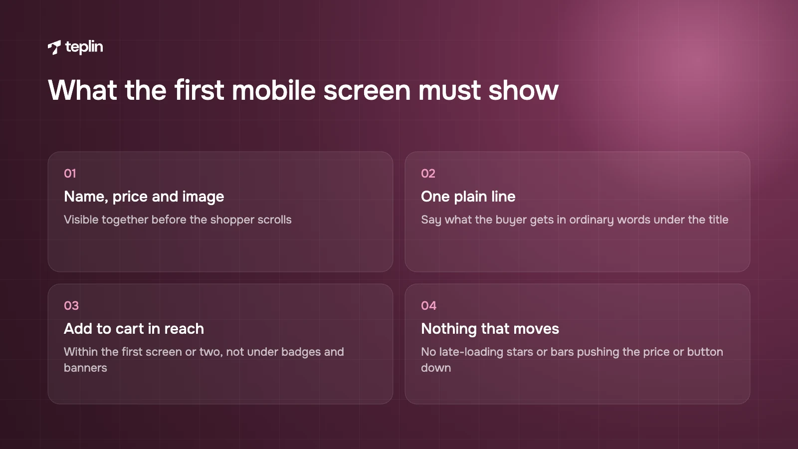
- 1. Product name, price and main image visible together
A shopper should see what it is, what it costs and what it looks like before scrolling. If the price sits below the fold on a standard phone, that gets fixed first. - 2. One plain line on what the product does
Under the title, say what the buyer gets in ordinary words. "Waterproof rubber strap that fits your Rolex Submariner" does more than a brand slogan ever will. - 3. Add to cart within reach
The button should appear within the first screen or two, not underneath long descriptions, badges and banners. - 4. Nothing that moves
Review stars, instalment messages and announcement bars that load late and push the price or button down cause mis-taps. I reload the page several times to catch this, because it is easy to miss on a fast connection.
Pass two is the gallery
Images carry more of the sale than copy does on most product pages. I go through the gallery asking one question per image. What would a customer have to email support about if this picture were missing?
- 5. Images that answer buying questions
Scale (on a wrist, in a room, in a hand), close-ups of texture, the product in use and what is in the box. Each picture should replace a support question. - 6. A gallery that obviously has more images
Visible thumbnails or dots, easy swiping and zoom that works on a phone. Shoppers who do not realise there are more images never see them. - 7. A short video where it genuinely helps
A 15 to 30 second clip of the product in use often explains more than five paragraphs. Load it lightly so it does not slow the page down.
Pass three is price and offer
This is where I see the most clutter. Brands add a badge for every promotion until the shopper cannot tell what they will actually pay.
- 8. A clear price with useful context
The price, any compare-at price shown honestly, and unit or per-serving cost where it helps buyers compare. - 9. One offer, stated once, near the price
If there is a bundle, a volume discount or a first-order offer, say it clearly beside the price. Three competing badges cancel each other out. - 10. Value explained on expensive items
What the price includes, how long the warranty runs, what the product replaces, and financing or instalment options where your markets support them.
Pass four is choosing a variant
Variant pickers are a design problem that often gets treated as a development detail. A confusing selector is one of the quickest ways to lose someone who has already decided to buy.
- 11. Swatches for colour and material
Buttons or swatches beat dropdowns for anything the shopper needs to see. I keep dropdowns for long lists such as sizes across several systems. - 12. Unavailable combinations marked before the click
Grey out or label out-of-stock options so nobody picks one and only then finds out. - 13. Help with complicated choices
Size guides, fit finders and compatibility checkers cut returns and support load. For Helvetus, a Swiss watch strap retailer, we built a strap finder by watch model and size as part of a full rebuild, alongside trust blocks and clearer navigation. Conversion rose by about 20% and support inquiries fell.
Pass five covers subscriptions where you sell them
Subscription pages fail in a predictable way. The subscribe option is either hidden or so pushy that the shopper suspects a trap.
- 14. Subscribe and one-time purchase side by side
Show the saving in money or percentage, the delivery frequency and how to pause or cancel. Shopify supports subscriptions as a purchase option, with several plans at different frequencies and discounts. - 15. A guided flow when there are several choices
When buyers pick flavours, quantities and frequency, a step-by-step selector is far clearer than a long form. For Ovrload, a UK creatine gummy brand, we rebuilt the store around a step-by-step funnel for flavours and subscription frequency. Conversion went from 2.03% to 4.6% and average order value rose 32%.
Pass six is delivery and returns next to the button
If I could only make one change to most product pages, it would be this pass. It answers the top reason in Baymard's list directly.
- 16. Delivery cost and free-delivery threshold beside the button
"Free UK delivery over £40" or "Delivery from €4.95" next to add to cart deals with the most common objection long before checkout. - 17. An expected delivery date or window
"Arrives Tue 21 – Thu 23 Oct" persuades more than "3 to 5 working days", as long as it is accurate for the shopper's market. - 18. Returns in one short line with a link
State the window and who pays ("30-day free returns"), then link to the full policy. Cross-border stores should also say whether duties are included.
Pass seven is proof and trust
- 19. Star rating and review count near the title
Link it to the review section, and keep the summary light so it does not delay the page or shift the layout as it loads. - 20. Reviews that answer the main objection
Surface reviews about fit, taste or durability, whichever matters for that product, and add topic filters if the volume justifies them. Photo reviews earn their place in fashion and accessories. - 21. Accelerated checkout where it suits the product
Shopify's accelerated checkout buttons (also called dynamic checkout buttons) sit next to add to cart and can show Shop Pay, Apple Pay, Google Pay, PayPal and others depending on settings and device. Each button buys a single variant, so check whether they help or distract on products people usually buy in combinations. - 22. Payment and security cues that mean something
Show the payment methods you actually accept. A generic "100% secure" badge adds little. Recognisable payment logos and a clear business identity do more. - 23. Warranty, guarantee and a way to ask a question
For considered purchases, a visible warranty and an easy route to chat, email or phone reduce hesitation.
Pass eight is the rest of the page
By now I am scrolling. The aim of everything below the buy box is to keep the action available and answer the second wave of questions.
- 24. A sticky add to cart bar on long mobile pages
Once the main button scrolls out of view, a slim bar with price and add to cart keeps the action in reach. It must reflect the selected variant and must not cover content or cookie controls. - 25. One relevant add-on rather than a wall of products
Shopify's Search and Discovery app lets you set complementary products (often bought together) and related products (alternatives), up to 10 manual picks each, if your theme supports those sections. Shopify suggests complementary items that cost the same as or less than the main product. - 26. Cross-sells placed after the main decision
Put add-ons below the buy box or in the cart drawer so they do not compete with the primary action. - 27. A description you can scan
Three to five benefit-led bullets first, then details in collapsible sections for ingredients or materials, dimensions, care and what is in the box. - 28. A product FAQ built from real questions
Pull questions from support tickets, chat logs and reviews and answer them on the page. It also helps search engines and AI assistants understand the product.
Pass nine is access and speed
- 29. Controls that work for everyone
Variant buttons, galleries and accordions should work with a keyboard and a screen reader, images need descriptive alt text, and text needs enough contrast. For stores selling to consumers in the EU, the European Accessibility Act has covered ecommerce services since 28 June 2025, with an exemption for microenterprises. - 30. A fast, stable page on mobile
The main image should appear quickly, choosing a variant should respond instantly, and nothing should jump. Our explainer on Core Web Vitals on Shopify covers the technical side and why it matters for conversion.
High-ticket pages need more depth
A shopper spending $1,500 on an ice bath or a piece of furniture compares more, comes back to the page several times and often needs a second person to agree. The checklist still applies, but I shift weight towards reassurance.
- Depth of information
Full specifications, dimensions, installation and running costs, and comparison with alternatives belong on the page, not in a PDF. - Risk reversal
Warranty terms, trial periods, delivery and installation details, and what happens if something goes wrong. - Payment flexibility
Instalment options, where your markets offer them, shown near the price. - Reasons to come back
Back-in-stock alerts, saved carts and an easy way to ask a question, because many buyers will not purchase on the first visit.
Expect the conversion rate to look lower too. Nordik Recovery, a Canadian ice bath brand we built on Shopify Plus, converted at 1.15% on a product of about $1,700 and took more than 500 orders in its first month. Against a generic store average that looks modest. For that price point it was a strong launch.
Benchmarks tell you less than you think
People ask me for a good conversion rate all the time, and I don't think a single number exists. Conversion depends on what you sell, what it costs, how much of your traffic is cold paid social rather than returning subscribers, and how sessions are counted. Public benchmarks are still useful as a sanity check.
- Store-level Shopify benchmark
Littledata's benchmark, generated in October 2026 from 427 Shopify stores over 90 days, shows a median conversion rate of 1.4% and a mean of 1.9%. The top 20% of stores convert above 2.6% and the top 10% above 3.6%. - Checkout abandonment
Baymard Institute's average documented cart abandonment rate is 70.22%, calculated from 50 studies.
Two cautions. These figures measure the whole store, not product pages, so for a PDP I would rather look at add-to-cart rate, meaning sessions that viewed a product and added it to the cart. And price changes everything, which is why the Nordik figure above should never be compared with a $30 consumable.
Most stores do not have the traffic for small A/B tests
This is the part of testing I wish more teams understood before they bought a testing tool. An A/B test shows two versions of a page to random groups of visitors. If the groups are too small, ordinary day-to-day noise can make a worse version look like the winner.
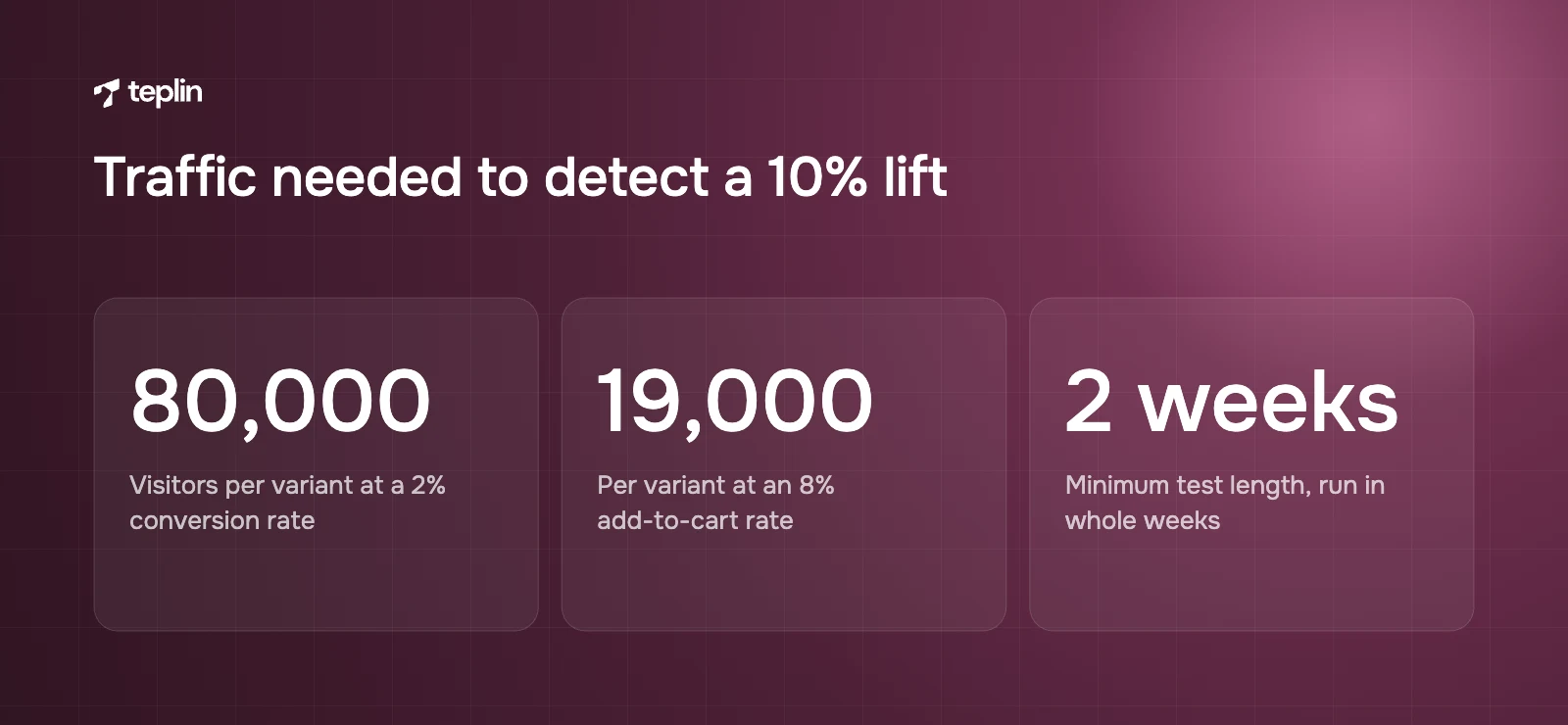
The standard sample size formula for comparing two conversion rates (95% confidence, 80% power) shows how quickly the numbers grow. Detecting a 10% relative lift on a 2% conversion rate, so from 2.0% to 2.2%, needs roughly 80,000 visitors per variant, about 160,000 in total. Measuring add-to-cart rate helps because it is a bigger number. With an 8% add-to-cart rate, the same 10% relative lift needs roughly 19,000 visitors per variant. Evan Miller's free sample size calculator, linked in the sources, lets you run your own numbers.
Two rules follow. Run tests for whole weeks, at least two, so weekday and weekend behaviour are both in the sample. And fix the test length before you start, instead of stopping when the result happens to look good.
Testing inside Shopify
Shopify now has a native option. Rollouts, announced on 5 June 2026 and found under Markets, then Rollouts in the admin, can schedule and publish theme and checkout changes and run experiments comparing a treatment against a control. Experiments need the Grow plan or higher, and theme experiments report conversion rate, bounce rate, reached checkout rate and add to cart rate. Third-party testing apps are still the choice when you want to test single page elements rather than whole theme versions.
What I would test at each traffic level
- Under about 10,000 product page sessions a month
Formal tests on small changes will rarely reach a reliable result. Fix clear problems directly using the checklist, research and session recordings, then compare a few weeks before and after while watching for seasonality and campaign changes. If you test at all, test big differences such as a new product page layout. - Roughly 10,000 to 100,000 sessions a month
Test bold changes on your busiest product pages with add-to-cart rate as the main metric. Good candidates are a new buy box layout, delivery information beside the button, a redesigned subscription selector or a different first image. - Above about 100,000 sessions a month
A regular programme of smaller tests becomes realistic, such as review placement, sticky bar behaviour or offer wording, with results split by device and traffic source.
At any traffic level, my first tests sit closest to the decision. That means the buy box, the delivery and returns line and the variant selector. Button colour almost never deserves a test slot.
The measurement setup I want before changing anything
I like to see where a page leaks before touching it, and to use the same measures afterwards. Numbers show where shoppers drop off. Qualitative tools show why.
- Shopify's conversion rate breakdown
This behaviour report in Shopify Analytics shows a funnel from all sessions to sessions with cart additions, sessions that reached checkout and sessions that completed checkout. You can switch between an open funnel, which counts visitors entering at any step, and a closed funnel, which counts only visitors who complete the steps in order and shows drop-off at each. - Add-to-cart rate by product
Compare products with similar traffic. One that adds to cart far less than its siblings usually has a page problem, such as weak images, unclear variants, a price surprise or missing information. - A funnel in your analytics tool
In GA4 or similar, build product view to add to cart to begin checkout to purchase, split by device and source. Mobile and desktop often behave very differently. - Heatmaps and scroll maps
See how far shoppers scroll, what they tap and whether they ever reach the delivery line or the reviews. - Session recordings
Watch 20 to 30 sessions on a key product page, focusing on visitors who did not add to cart. Patterns such as repeated taps on a size guide or swiping straight past the gallery show up quickly. - Support tickets and on-site surveys
Every pre-purchase question that reaches support is a gap on the page. A one-question survey ("What, if anything, stopped you from buying today?") fills in the rest.
If tracking is unreliable, fix that before anything else. A conversion project built on broken data produces confident decisions in the wrong direction.
Putting the checklist to work
- Pick the pages that matter
Start with the five to ten products that get the most traffic or the most ad spend. - Record a baseline
Note conversion rate, add-to-cart rate and revenue per session for those pages over the last 30 to 90 days, by device. - Do the research
Review heatmaps, recordings, support tickets and reviews, and walk through the page yourself on a mid-range phone. - Run the 30 points
Mark each as done, missing or weak, and order the fixes by expected impact and effort. - Fix the obvious directly
Missing delivery information, broken variant states, layout shifts and slow images do not need a test. - Test the bigger bets
If traffic allows it, test larger changes such as a new buy box or a guided selector. - Repeat
Check the funnel monthly and redo the research each quarter, especially after adding apps or changing theme.
Frequently asked questions
What is a good conversion rate for a Shopify store?
Littledata's October 2026 benchmark of 427 Shopify stores shows a median of 1.4%, with the top 20% above 2.6% and the top 10% above 3.6%. A store selling products over $1,000 will usually convert lower than one selling $30 consumables, so compare yourself with similar stores and with your own history.
Should my product page use a sticky add to cart button?
On long mobile product pages it usually helps, because the main button scrolls away quickly. It has to reflect the selected variant and price, and it should not cover important content or controls. On short pages where the button is always visible, it adds little.
Can I A/B test on Shopify without an app?
Yes, through Rollouts, which Shopify added in 2026. Experiments compare a treatment with a control for theme and checkout changes and need the Grow plan or higher. For tests of individual elements or more advanced targeting, third-party testing apps are still common.
How long should a product page test run?
Until it reaches the sample size you calculated before starting, and for at least two full weeks so weekday and weekend behaviour are both covered. Stopping as soon as one version looks ahead is the most common way to crown a false winner.
A checklist is easier to run on someone else's store than your own, because after a few months you stop seeing your pages. If you would like fresh eyes on yours, our CRO and UX team will go through your top product pages against these 30 points and tell you which fixes to make now and which are worth testing. Drop us a line on the contact page with the URLs you care about most.
Sources
- Shopify Help Center – Behaviour reports (conversion rate breakdown)
- Shopify Help Center – Rollouts
- Shopify Help Center – Rollout analytics
- Shopify Changelog – Schedule, publish and A/B test new themes and checkout configurations (June 2026)
- Shopify Help Center – Accelerated checkout buttons
- Shopify Help Center – Shopify Subscriptions
- Shopify Help Center – Product recommendations
- Littledata – Average ecommerce conversion rate for Shopify stores (October 2026)
- Baymard Institute – Cart abandonment rate statistics
- EUR-Lex – Directive (EU) 2019/882 (European Accessibility Act)
- Evan Miller – A/B test sample size calculator
- Teplin – Ovrload case study
- Teplin – Helvetus case study
- Teplin – Nordik Recovery case study

Get a free Shopify store audit

.webp)
Stay ahead of the curve

More from our resources
Is Shopify Plus Worth $2,300 a Month? Here Is the Real Bill





Ecommerce insights, straight to your inbox


10:33

10:33

16:33